
Taylor Swift Album Covers: A Visual Guide to Every Era
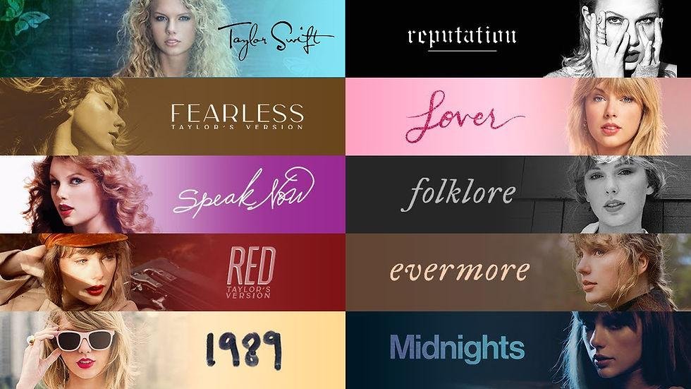
If you want to understand Taylor Swift’s career without listening to a single song, start with her album covers. Over the years, her artwork has moved from the soft, youthful country look of her self-titled debut to the dramatic black-and-white world of reputation, the dreamy pastel colors of Lover, the stripped-back photography of folklore, & the intimate, moody imagery of The Tortured Poets Department. Each cover feels like a doorway into a particular chapter of her life & music.
That is what makes Taylor Swift album covers so interesting. They are not simply pictures placed on the front of a CD or vinyl record. They help establish the mood before you hear the first note. When fans search for Taylor Swift album art, Taylor Swift album artwork, or all Taylor Swift album covers, they are often looking for more than a collection of photographs. They are tracing the visual story that connects one era to another.
Taylor’s official website now presents her career through an archive of eras, including her original albums, Taylor’s Version projects, Midnights, The Tortured Poets Department, & The Life of a Showgirl. That makes the visual evolution especially easy to appreciate. Put the covers side by side & you can almost watch her artistic identity change in real time.
For U.S. fans, collectors, casual listeners, & anyone looking for Taylor Swift album photos, this guide breaks down the major album covers in chronological order & explains what makes each visual identity distinctive.
Why Taylor Swift Album Covers Matter
An album cover has a surprisingly difficult job. It needs to represent an entire collection of songs in one image, sometimes before the listener knows anything about the music. Taylor Swift has consistently treated that challenge as part of the creative process. Instead of relying on one permanent visual formula, she has used photography, typography, color, fashion, locations, poses, & carefully selected moods to make each era recognizable.
Think about how quickly a fan can identify different Taylor Swift eras from a single image. A washed-out country photograph immediately feels different from the neon glamour of 1989. A black-and-white newspaper-inspired design points toward reputation, while soft blue skies & pastel colors evoke Lover. That immediate recognition is one reason searches for Taylor Swift album cover & Taylor Swift album artwork remain popular.
Her covers also show how much visual storytelling has become part of modern pop music. An album is no longer just a collection of audio files. The cover, music videos, photography, merchandise, stage design, physical packaging, & social media imagery can all contribute to the identity of an era.
From Country Roots to Pop Stardom
Taylor’s earliest album imagery reflects the country-pop world in which she began her career. Her self-titled debut has a youthful, approachable quality that feels very different from the carefully constructed visual worlds that came later. The photography communicates an emerging singer-songwriter rather than an established global pop star.
With Fearless, the visual identity became more polished while still retaining a romantic, youthful quality. The album’s imagery helped reinforce the themes of young love, uncertainty, growing up, & dreaming about what might happen next.
By the time Speak Now arrived, Taylor had developed a stronger visual signature. The purple color palette, flowing styling, & theatrical atmosphere made the era immediately recognizable. The cover itself became part of the mythology surrounding the album.
How Her Visual Style Keeps Changing
One of the strongest characteristics of Taylor Swift’s career is visual reinvention. She does not appear interested in making every album look like the previous one. Instead, each project gets its own palette, photography style, typography, & emotional temperature.
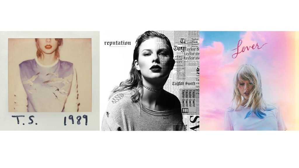
That change is particularly obvious when looking at all Taylor Swift album covers together. The transition from Red to 1989, for example, feels like a deliberate visual reset. 1989 trades the warm, rustic feeling of earlier records for a cooler, more metropolitan aesthetic.
Then comes reputation, which almost rejects the polished brightness of 1989. The dark imagery, monochrome styling, & newspaper textures suggest a more confrontational period.
Lover swings in the opposite direction with bright colors, clouds, hearts, & a romantic atmosphere. Later, folklore & evermore move toward muted, natural photography & a quieter visual language.
Taylor Swift Album Covers in Order
Looking at Taylor Swift albums covers chronologically is one of the easiest ways to understand her evolution. The official Taylor Swift archive itself presents her music through a series of recognizable eras, making the chronological approach particularly useful for fans.
Taylor Swift

The self-titled Taylor Swift album introduced listeners to a young singer-songwriter whose music blended country storytelling with accessible pop melodies. The cover’s styling feels youthful & natural, matching the personality associated with Taylor at the beginning of her career.
Visually, this is one of the least complicated identities in her catalog. There is no elaborate conceptual universe competing for attention. Instead, the focus is on Taylor herself & the feeling of a young artist beginning to tell personal stories through music.
That simplicity is part of its charm. When people search for the Taylor Swift album cover, they may be looking specifically for the original debut artwork because it represents the beginning of the entire journey.
The debut cover also provides an interesting comparison point for everything that followed. Place it next to Midnights or The Tortured Poets Department, & the scale of the transformation becomes obvious.
Fearless

Fearless introduced a more romantic & polished visual identity. The artwork is closely associated with the youthful optimism of the era, making it one of the most recognizable entries among Taylor Swift album covers.
The styling reflects the emotional world of the music: first love, uncertainty, heartbreak, hope, & the excitement of being young. The photography still feels approachable, but Taylor’s image is becoming more deliberate & sophisticated.
The original Fearless cover also became important again when Fearless (Taylor’s Version) arrived. The re-recording gave fans a new visual representation of a familiar era, while retaining the connection to the original album.
Taylor’s official store continues to feature physical releases associated with Fearless (Taylor’s Version), including CD & vinyl formats.
Speak Now
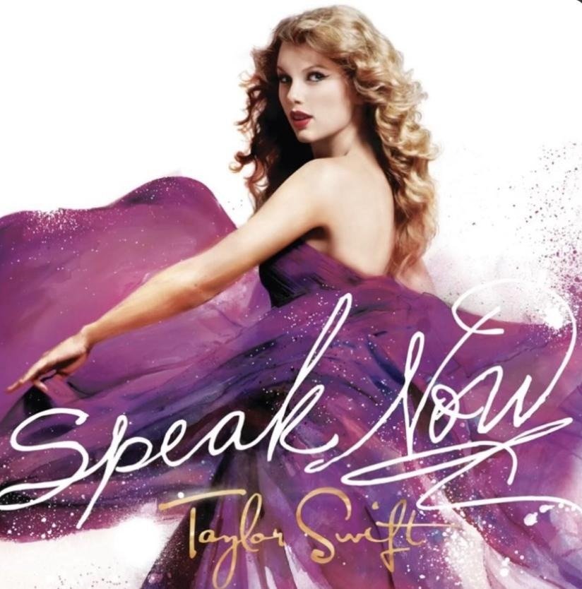
Purple is almost inseparable from the Speak Now era. The album cover’s flowing dress, movement, & purple-toned atmosphere create an instantly recognizable visual identity.
The artwork feels theatrical without becoming overly complicated. It suggests motion, romance, & fantasy while still keeping Taylor as the central figure.
This is one reason the Speak Now cover remains popular among fans searching for Taylor Swift album photos or visual references for different eras. It is distinctive enough to be recognized almost immediately.
The later Speak Now (Taylor’s Version) project brought the era back into focus with new physical editions & artwork. The official store currently lists Speak Now (Taylor’s Version) physical music products, including a 3LP edition & CD.
Red
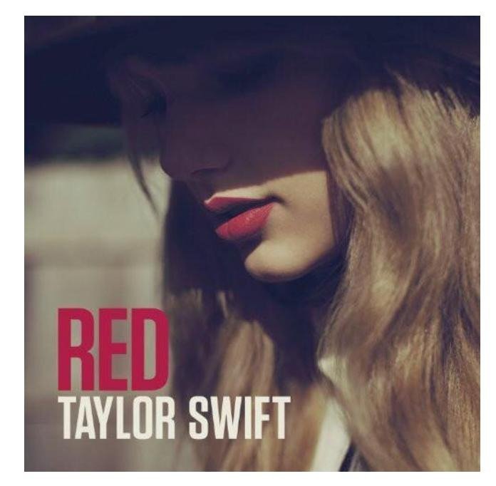
Red marked a major visual & musical turning point. The artwork uses a warm, autumnal atmosphere & a close-up portrait that feels more mature than the imagery of the earlier albums.
The title itself becomes visually important. Red is associated with intense emotions, love, heartbreak, anger, passion, & nostalgia, & the era’s imagery consistently reinforces those themes.
Among Taylor Swift albums covers, Red is particularly memorable because it feels both personal & cinematic. The simple styling allows the emotional tone to do much of the work.
The re-recorded Red (Taylor’s Version) also expanded the visual life of the album. The official Taylor Swift store currently lists Red (Taylor’s Version) CDs & vinyl products, including different physical editions.
1989
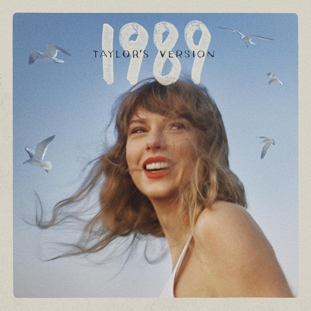
Then came 1989, & the visual shift was unmistakable.
The cover moves away from the full-face portraits associated with earlier records & introduces a more cropped, editorial style. The polaroid-inspired aesthetic & New York imagery helped establish the album’s modern, urban personality.
This is where Taylor Swift album art becomes especially interesting from a branding perspective. The visual identity was not limited to one photograph. It extended into fashion, photography, typography, music videos, & the broader public image of the era.
The title 1989 also connected the album to a specific cultural moment, while the artwork gave the project a contemporary pop identity.
The later 1989 (Taylor’s Version) brought that recognizable aesthetic back to audiences while creating a new chapter in the re-recording project. Taylor’s official archive includes 1989 Taylor’s Version among the eras represented on her website.
Reputation
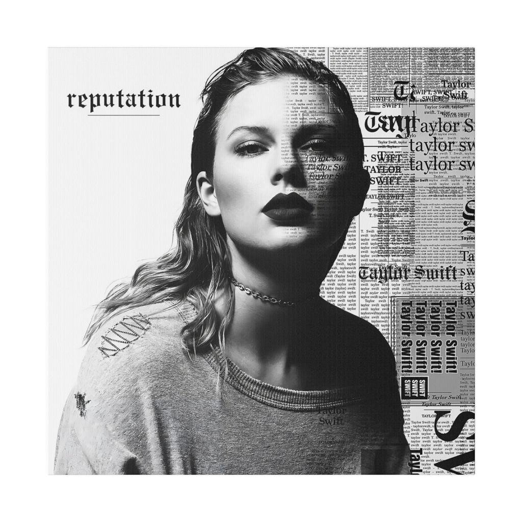
If 1989 represented polished pop brightness, reputation went in the opposite direction.
The reputation album cover is dominated by black, white, & newspaper-inspired imagery. The visual language is sharper & more confrontational. Even the typography feels like a statement.
This cover works because it communicates attitude before the listener hears the music. You can look at the artwork & immediately understand that this is not intended to be another version of 1989.
The era also demonstrated how album artwork can become part of a larger narrative. Reputation was about public perception, media attention, celebrity, identity, relationships, & reinvention. The visual design supported those themes without explaining them literally.
That makes reputation one of the strongest examples of Taylor Swift album artwork functioning as storytelling.
Lover

After the darkness of reputation, Lover arrived like a burst of color.
The artwork uses pastel tones, clouds, soft lighting, & a dreamy atmosphere. It feels playful, romantic, & intentionally bright.
The contrast with reputation is one of the most satisfying visual transitions in Taylor’s catalog. If you put the two covers next to each other, they almost look like they belong to different artists.
Yet that contrast is exactly the point. Taylor’s album covers often work as visual statements about change.
The Lover artwork also fits the album’s emotional themes. Love is not represented as something dark or secretive. Instead, the visual world is colorful, open, vulnerable, & optimistic.
The official Taylor Swift store still offers physical Lover music, including a standard CD & several deluxe CD editions.
folklore & evermore

The visual identity of folklore represented another dramatic departure.
Gone were the bright colors & glamorous pop styling. Instead, the cover used muted photography & a black-and-white, almost cinematic atmosphere.
The image feels distant & mysterious. Taylor appears smaller within the landscape, which creates a different relationship between the artist & the viewer.
Then came evermore, which continued the more understated aesthetic while developing its own visual language.
Together, folklore & evermore demonstrate that Taylor’s album artwork does not always need bright colors or elaborate fashion to be memorable. Sometimes restraint creates a stronger impression.
The official store continues to list evermore physical editions, including deluxe vinyl & CD products.
Midnights
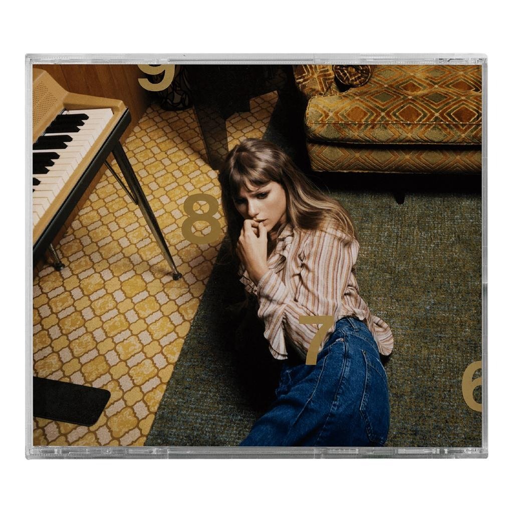
Midnights brought Taylor into a darker, more nocturnal visual world.
The cover’s design feels intimate & fragmented, with imagery that suggests late-night thoughts, memories, anxiety, self-reflection, & private moments.
Unlike some of the earlier album covers, Midnights does not rely on an elaborate narrative scene. Instead, the artwork feels like a collection of clues.
The visual identity also became highly collectible because the album was released in multiple editions. Taylor’s official store continues to offer different Midnights physical formats, including CD & deluxe editions.
For collectors searching for Taylor Swift CD covers, Midnights is particularly interesting because different physical editions can have distinct packaging & visual elements.
The Tortured Poets Department

The Tortured Poets Department introduced another dramatic visual mood.
The artwork leans heavily into monochrome photography & emotional minimalism. Instead of bright colors or an obviously commercial pop aesthetic, the imagery feels intimate, literary, & deliberately serious.
The title itself contributes heavily to the visual identity. The combination of monochrome photography, typography, & poetic language makes the album feel like a collection of private documents.
This is another example of Taylor using album artwork as an extension of the music rather than simply creating a promotional photograph.
The official Taylor Swift archive includes The Tortured Poets Department as its own era.
The Life of a Showgirl
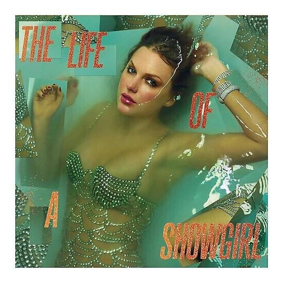
Taylor’s official website currently also features The Life of a Showgirl as an era in its archive.
Its inclusion is important when creating a current guide to all Taylor Swift album covers, because an evergreen article needs to account for the latest officially represented era rather than stopping with older albums.
The official store likewise currently lists The Life of a Showgirl merchandise & music products, including physical releases.
For anyone collecting album artwork, this newer era is another reminder that Taylor’s visual identity continues to evolve rather than settling into one recognizable formula.
Taylor’s Version Album Covers
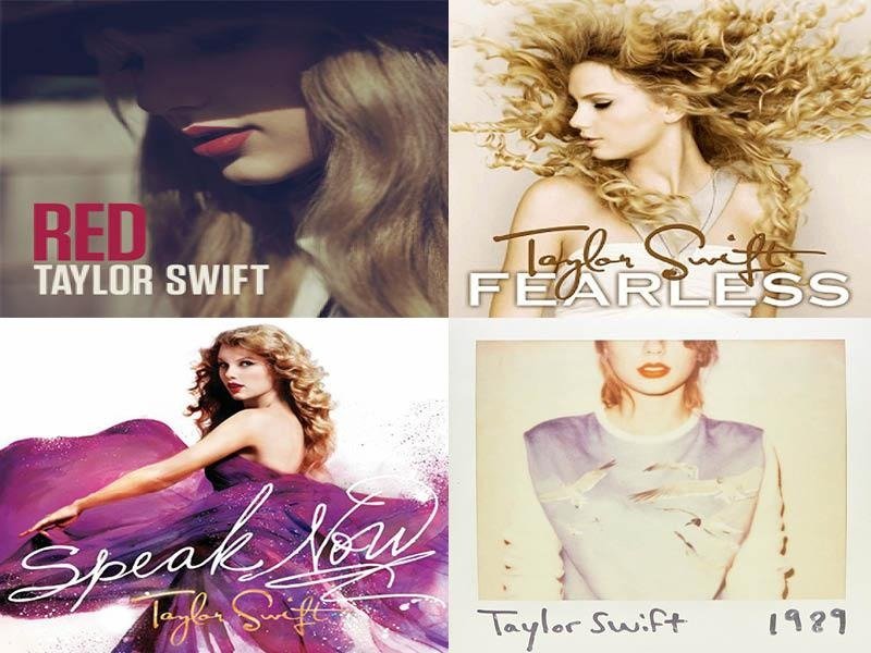
Taylor’s re-recorded albums created a fascinating second layer of visual history. Rather than simply replacing the original records, projects such as Fearless (Taylor’s Version), Red (Taylor’s Version), Speak Now (Taylor’s Version), & 1989 (Taylor’s Version) gave familiar eras new artwork & physical editions.
Taylor’s official archive specifically separates several Taylor’s Version projects within its era guide.
For fans, this means there can be two closely related visual identities for the same musical era. The original album cover represents the period when the album was first released, while the Taylor’s Version cover represents Taylor revisiting that material years later.
How the Re-recorded Covers Differ
The difference is not always about completely changing the visual concept. Often, the newer artwork maintains recognizable elements while presenting Taylor at a different point in her career.
That creates an interesting visual conversation between past & present.
A fan looking at all Taylor Swift album covers can therefore study not only how Taylor’s aesthetic changed from album to album, but also how she revisited earlier aesthetics.
The physical releases make this even more noticeable. The official store currently carries Taylor’s Version CDs, vinyl, & other music formats, giving collectors opportunities to compare packaging as well as the front artwork.
Taylor Swift CD Covers & Physical Editions
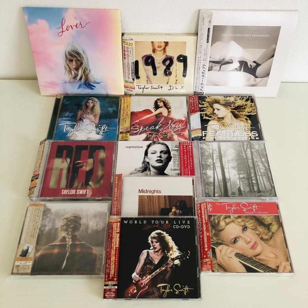
There is something different about seeing a Taylor Swift CD cover in person compared with viewing a small digital thumbnail.
Physical albums can include front covers, back covers, booklets, lyric sheets, photographs, inserts, alternate artwork, & collectible packaging. Taylor has leaned heavily into that physical experience, particularly with deluxe & special editions.
The official Taylor Swift store currently lists numerous physical releases across her catalog. For example, the store includes Lover CDs, Red (Taylor’s Version) CDs, Speak Now (Taylor’s Version) CDs, Fearless (Taylor’s Version) CDs, & different Midnights editions.
That variety matters to collectors. Two copies of the same album may contain different packaging or edition-specific materials.
It is also why searches for Taylor Swift CD covers can mean several different things. Some people simply want to see the standard front artwork. Others want to compare deluxe editions, alternate covers, back covers, or complete physical packaging.
What Makes Taylor Swift Album Art So Memorable
The biggest strength of Taylor Swift’s visual catalog is consistency within each era & contrast between eras.
Each album tends to establish its own visual vocabulary. Colors, photography, styling, typography, locations, & emotional tone work together to create a recognizable identity.
Consider the journey:
Taylor Swift feels youthful & country-inspired.
Fearless feels romantic & optimistic.
Speak Now feels theatrical & purple-toned.
Red feels emotional & autumnal.
1989 feels metropolitan & polished.
reputation feels dark & confrontational.
Lover feels colorful & romantic.
folklore feels quiet & atmospheric.
evermore continues that earthy, literary mood.
Midnights feels nocturnal & introspective.
The Tortured Poets Department feels monochromatic, literary, & emotionally exposed.
The Life of a Showgirl adds another visual chapter to the ongoing story.
That progression is why Taylor Swift album artwork has become such an important part of fan culture. The covers help people remember where they were, what an era felt like, & how Taylor’s artistic identity was changing.
There is also a practical SEO lesson here for publishers creating content around album artwork. A useful page should not simply repeat the phrase “Taylor Swift album covers” dozens of times. It should answer the questions people actually have: What are the albums in order? Which cover belongs to which era? What changed between original & Taylor’s Version artwork? Which albums have alternate physical editions? Where can fans find official releases?
That kind of topical coverage is more useful to readers & creates a stronger semantic relationship between the primary keyword & supporting terms such as Taylor Swift album cover, Taylor Swift album art, Taylor Swift album photos, Taylor Swift albums covers, & Taylor Swift CD covers.
For image SEO, every image should also have descriptive alt text that explains what the reader is seeing rather than stuffing keywords unnaturally. A useful alt description might identify the album & explain that the image shows its official cover artwork. Image filenames should be descriptive too, while captions should be used when they genuinely add context.
Most importantly, publishers should be careful about copyright. Album covers & promotional photographs are copyrighted works, so a page intended for publication should use properly licensed images, official embeds where appropriate, or other imagery that the publisher has permission to display. Search visibility is not a substitute for image rights.
Conclusion
Taylor Swift album covers tell a visual story that is almost as interesting as the music itself. From the youthful country-pop identity of her debut to the romantic styling of Fearless, the theatrical purple world of Speak Now, the emotional red palette of Red, & the metropolitan photography of 1989, every era has its own personality.
Then the story changes again. reputation becomes darker & more confrontational, Lover introduces bright romantic colors, folklore & evermore embrace muted photography, Midnights explores a nocturnal aesthetic, & The Tortured Poets Department adopts a stark monochrome mood.
Taylor’s Version adds another layer by allowing fans to revisit familiar eras through new releases & artwork. The official Taylor Swift archive currently presents these eras together, while the official store continues to offer a range of physical music editions.
Whether you are a longtime Swiftie, a new listener, a CD collector, or simply interested in pop music design, looking through all Taylor Swift album covers is a surprisingly effective way to understand the evolution of her career.
The music changes. The fashion changes. The photography changes. The colors change.
And that is exactly what makes the artwork so memorable.
FAQs
1. What are the Taylor Swift albums in order?
Taylor Swift’s major album eras begin with Taylor Swift, followed by Fearless, Speak Now, Red, 1989, reputation, Lover, folklore, evermore, Midnights, & The Tortured Poets Department. Taylor’s Version releases revisit several earlier albums, & Taylor’s official archive currently also features The Life of a Showgirl.
2. Where can I find official Taylor Swift album covers?
The best starting point is Taylor Swift’s official website & its Swiftie Archive, which organizes her work by era. The official store is another useful source for checking current physical music releases & their packaging.
3. Which Taylor Swift album cover is the most recognizable?
That is subjective, but covers from eras such as 1989, reputation, Lover, folklore, & Midnights are particularly distinctive because each uses a strong & immediately recognizable visual style.
4. Are Taylor Swift CD covers different from vinyl covers?
Sometimes. The primary artwork may remain the same, but physical formats can have different packaging, inserts, dimensions, booklets, or edition-specific artwork. Taylor’s official store currently lists multiple CD & vinyl formats across her catalog.
5. Why are Taylor Swift album covers important to her eras?
The artwork establishes the mood & visual identity of each musical period. Colors, photography, styling, typography, & imagery help distinguish one era from another, making the covers an important part of Taylor Swift’s overall artistic storytelling.
